# install package if you do not have them install.package
library(WDI) # gapminder data
library(countrycode) # for mapping continent
library(echarts4r) # make echarts using R
library(dplyr, warn.conflicts = FALSE) # data manipulation
library(tidyr, warn.conflicts = FALSE) # handling na
library(purrr, warn.conflicts = FALSE) # functional programming
library(listviewer) # view nested list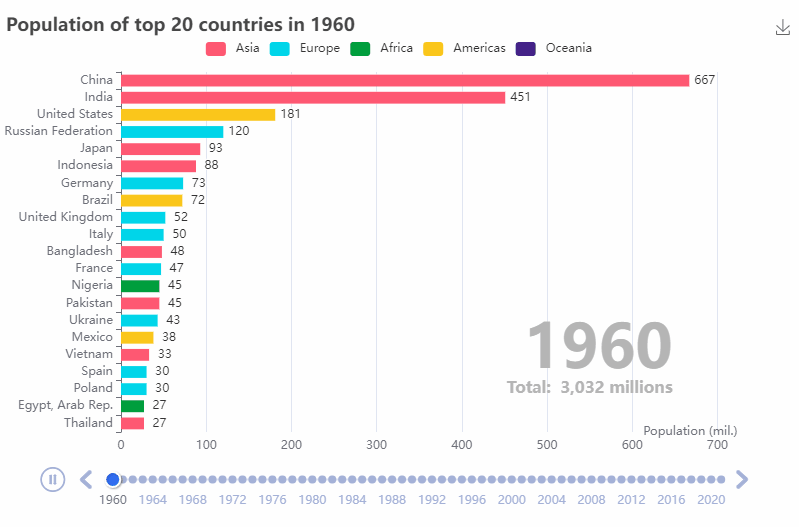
Introduction
In the previous post, I show how to make an animated gapminder chart R, echarts and echarts4r package. In this post, I will show how to make another animated chart called a bar race like this one where we want to show how population of individual countries have changed overtime. Let’s get start.
Step 0: Load packages
First, we load required R packages as follows
Step 1: Data Preparation
Next step is to load data and transform data for data visualization. We use WDI package by Vincent Arel-Bundock that can download Worldbank data using R function call. We also use countrycode by the same author for mapping continent information of each country.
We can download data from using WDI function by giving an indicator for total population is SP.POP.TOTL.
df <- WDI(indicator = "SP.POP.TOTL", extra = TRUE) |> # get data
  rename(pop = SP.POP.TOTL) |> # simplify name
  as_tibble() |> # convert to tibble
  mutate(pop = round(pop/1e6, 0)) |> # change unit to millions
  arrange(year, -pop) # reorder by year
Let’s explor our data.
df#> # A tibble: 16,492 × 13
#> iso2c country pop year status lastu…¹ iso3c region capital longi…² latit…³
#> <chr> <chr> <dbl> <int> <chr> <chr> <chr> <chr> <chr> <chr> <chr>
#> 1 1A Arab W… 92 1960 "" 2022-0… ARB Aggre… "" "" ""
#> 2 1W World 3032 1960 "" 2022-0… WLD Aggre… "" "" ""
#> 3 4E East A… 895 1960 "" 2022-0… EAP Aggre… "" "" ""
#> 4 7E Europe… 256 1960 "" 2022-0… ECA Aggre… "" "" ""
#> 5 8S South … 573 1960 "" 2022-0… SAS Aggre… "" "" ""
#> 6 AD Andorra 0 1960 "" 2022-0… AND Europ… "Andor… "1.521… "42.50…
#> 7 AE United… 0 1960 "" 2022-0… ARE Middl… "Abu D… "54.37… "24.47…
#> 8 AF Afghan… 9 1960 "" 2022-0… AFG South… "Kabul" "69.17… "34.52…
#> 9 AG Antigu… 0 1960 "" 2022-0… ATG Latin… "Saint… "-61.8… "17.11…
#> 10 AL Albania 2 1960 "" 2022-0… ALB Europ… "Tiran… "19.81… "41.33…
#> # … with 16,482 more rows, 2 more variables: income <chr>, lending <chr>, and
#> # abbreviated variable names ¹lastupdated, ²longitude, ³latitude
#> # ℹ Use `print(n = ...)` to see more rows, and `colnames()` to see all variable namesNote that WDI retrieve aggregates data where the world is indicated by iso2c equals 1W.
df |> distinct(region)#> # A tibble: 9 × 1
#> region
#> <chr>
#> 1 Aggregates
#> 2 Europe & Central Asia
#> 3 Middle East & North Africa
#> 4 South Asia
#> 5 Latin America & Caribbean
#> 6 Sub-Saharan Africa
#> 7 East Asia & Pacific
#> 8 North America
#> 9 <NA>df |> filter(region == "Aggregates") |> distinct(iso2c, country, region)#> # A tibble: 47 × 3
#> iso2c country region
#> <chr> <chr> <chr>
#> 1 1A Arab World Aggregates
#> 2 1W World Aggregates
#> 3 4E East Asia & Pacific (excluding high income) Aggregates
#> 4 7E Europe & Central Asia (excluding high income) Aggregates
#> 5 8S South Asia Aggregates
#> 6 B8 Central Europe and the Baltics Aggregates
#> 7 EU European Union Aggregates
#> 8 F1 Fragile and conflict affected situations Aggregates
#> 9 OE OECD members Aggregates
#> 10 S1 Small states Aggregates
#> # … with 37 more rows
#> # ℹ Use `print(n = ...)` to see more rowsWe will create two data frame for futher uses where one is for total population called df_world and the other one is for indivudal country called df_country. We also want to know the continent of country instead of region so we join continent information using codelist from countrycodes package.
df_world <- df |> filter(iso2c == "1W")

df_country <- df |>
  filter(region != "Aggregates") |>
  drop_na(pop) |>
  left_join(codelist[, c("iso2c", "continent")], by = "iso2c")
As we join data, we should check whether there is missmatch. We found that there are two countries that do not have continent which are Channel Islands and Kosovo. Since they are in Europe, we correct it and save it to df_country.
df_country |> filter(is.na(continent)) |> count(iso2c, country)#> # A tibble: 2 × 3
#> iso2c country n
#> <chr> <chr> <int>
#> 1 JG Channel Islands 62
#> 2 XK Kosovo 62df_country <- df_country |>
mutate(continent = if_else(is.na(continent), "Europe", continent))As a final data, we will visualize total population of 216 countries from 1960 - 2021.
df_country |> count(country)#> # A tibble: 217 × 2
#> country n
#> <chr> <int>
#> 1 Afghanistan 62
#> 2 Albania 62
#> 3 Algeria 62
#> 4 American Samoa 62
#> 5 Andorra 62
#> 6 Angola 62
#> 7 Antigua and Barbuda 62
#> 8 Argentina 62
#> 9 Armenia 62
#> 10 Aruba 62
#> # … with 207 more rows
#> # ℹ Use `print(n = ...)` to see more rowsdf_country |> count(year)#> # A tibble: 62 × 2
#> year n
#> <int> <int>
#> 1 1960 216
#> 2 1961 216
#> 3 1962 216
#> 4 1963 216
#> 5 1964 216
#> 6 1965 216
#> 7 1966 216
#> 8 1967 216
#> 9 1968 216
#> 10 1969 216
#> # … with 52 more rows
#> # ℹ Use `print(n = ...)` to see more rowsStep 2: Initialize an echart with timeline
We initialize an echart with timeline using echarts4r and group_by and assign to p variable. This will create an empty canvas with time slider. We also use jsonedit function from listviewer to see the nested list used by echarts. Note that we map country to x axis (where we will flip to y axis later).
p <- df_country |>
group_by(year) |>
e_charts(country, timeline = TRUE)
pStep 3: Make a bar chart
Now, we make a bar plot using e_bar where we map pop to y-axis and then flip to x-axis using e_flip_coords for better visual. Note that realtimeSort uses for sorting as time change. label is for label the value at the right of each bar. We turn off legend because later we want to add color to represent continent.
p <- p |>
e_bar(
pop,
realtimeSort = TRUE,
legend = FALSE,
label = list(
show = TRUE,
precision = 1,
position = 'right'
)
) |>
e_flip_coords()
pStep 4: Adjust x and y axis
- We add x-axis labels via
e_x_axis. - We want to reorder by putting most population at the top of the chart by setting
inverse = TRUEine_y_axis. - The chart has too many countries, we will show only top 20 using
max = 20ine_y_axis. - Moreover, we can modify animation effect with
animationDurationandanimationDurationUpdatearguement ine_y_axis. - Last, we modify the margin of y-axis as country name is long using
e_grid.
p <- p |>
e_x_axis(
name = 'Population (mil.)',
nameLocation = "end",
nameGap = 20,
nameTextStyle = list(align = "right")
) |>
e_y_axis(
inverse = TRUE,
max = 20,
animationDuration = 150,
animationDurationUpdate = 150,
) |>
e_grid(left = 120, bottom = 80)
pStep 5: Assign color to continent and create a legend
We follow the approach from my previous post using custom e_add_value function to assign continent to colors.
# define colors
continent_colors <- c(
"Asia" = "#ff5872",
"Europe" = "#00d5e9",
"Africa" = "#009f3d",
"Americas" = "#fac61b",
"Oceania" = "#442288"
)
# define e_add_value
e_add_value <- function(e, ...) {
for (i in seq_along(e$x$data)) {
# extract data to be added
data <- e$x$data[[i]] |>
dplyr::select(...) |>
apply(1, as.list)
for (j in seq_along(data)) {
data_append <- data[[j]] |> unname()
if (!e$x$tl) { # if timeline is not used
# get data from current echart object
data_origin <- e$x$opts$series[[i]]$data[[j]][["value"]]
# append data from selection
data_new <- list(data_origin, data_append) |> flatten() |> list()
# assign to echart object
e$x$opts$series[[i]]$data[[j]]["value"] <- data_new
} else { # if timeline is used
# get data from current echart object
data_origin <- e$x$opts$options[[i]]$series[[1]]$data[[j]][["value"]]
# append data from selection
data_new <- list(data_origin, data_append) |> flatten() |> list()
# assign to echart object
e$x$opts$options[[i]]$series[[1]]$data[[j]]["value"] <- data_new
}
}
}
e
}Apply e_add_value to change color by continent
p <- p |>
e_add_value(continent) |>
e_visual_map(
type = "piecewise", # discrete/categorial variable
dimension = 2, # in java first element start with 0
categories = names(continent_colors), # label
inRange = list(color = unname(continent_colors)), # hex color
orient = "horizontal", # apperance
top = "5%", # apperance
left = "center" # apperance
)
p
Note
One limitation of using visual_map feature is we could not dynamically filter data because it only disable visual from the chart. It could be a way(s) to dynamically choose continent(s) of interest using echarts but I still could not find a way yet. However, one possible solution is to add a html input to filter data before putting it into echarts.
Step 6: Customize time slider and animation
We can customize behavior and apperance of time slider using e_timeline_opts function and we adjust animation effect using e_animation function.
p <- p |>
e_timeline_opts(
axisType = "category",
autoPlay = FALSE,
orient = "horizontal",
playInterval = 300,
symbolSize = 8,
left = "center",
width = "90%",
loop = FALSE
) |>
e_animation(
duration = 300,
duration.update = 300,
easing = "linear",
easing.update = "linear"
)
pStep 7: Polish the chart
There are a couple things to improve the chart.
- We will add a chart title.
- We will annotate each time frame with information about year of the data.
- We will annotate each time frame with information about total population.
- We add toolbox for saving image using
e_toolbox_feature.
Again, We follow the approach from my previous post using custom e_title_timeline function to assign title for each time frame. We create three lists including
- main title
- year
- total population of each year
# define e_title_timeline function
e_title_timeline <- function (e, title) {
# loop over group_by data
for (i in 1:length(e$x$opts$options)) {
# append original title with new title
e$x$opts$options[[i]][["title"]] <- append(
e$x$opts$options[[i]][["title"]], title[i]
)
}
e
}
# main title
title_main <- map(
as.character(df_country$year) |> unique(),
function(x) {
list(
text = paste0("Population of top 20 countries in ", x),
left = "0%",
top = "0%",
textStyle = list(fontSize = 18)
)
}
)
# time title for annotation
title_year <- map(
as.character(df_country$year) |> unique(),
function(x) {
list(
text = x,
right = "15%",
bottom = "25%",
textStyle = list(
color = "#b5b5b5",
fontSize = 60
)
)
}
)
# time title for total population
title_popsize <- map(
as.character(df_world$year) |> unique(),
function(x) {
list(
text = paste(
"Total: ",
format(
df_world |> filter(year == x) |> pull(pop),
nsmall = 0, big.mark = ","
),
"millions"
),
right = "15%",
bottom = "22%",
textStyle = list(
color = "#b5b5b5",
fontweight = 200,
fontSize = 16
)
)
}
)Add titles and toolbox to the chart.
p <- p |>
e_title_timeline(title = title_main) |>
e_title_timeline(title = title_year) |>
e_title_timeline(title = title_popsize) |>
e_toolbox_feature(feature = c("saveAsImage"))
pPut it all together
# load libraries
library(WDI)
library(countrycode)
library(echarts4r)
library(dplyr, warn.conflicts = FALSE)
library(tidyr, warn.conflicts = FALSE)
library(purrr, warn.conflicts = FALSE)
library(listviewer)
# data preparation
df <- WDI(indicator = "SP.POP.TOTL", extra = TRUE) |>
rename(pop = SP.POP.TOTL) |>
as_tibble() |>
mutate(pop = round(pop/1e6, 0)) |>
arrange(year)
df_world <- df |> filter(iso2c == "1W")
df_country <- df |>
filter(region != "Aggregates") |>
drop_na(pop) |>
left_join(codelist[, c("iso2c", "continent")], by = "iso2c")
df_country <- df_country |>
  mutate(continent = if_else(is.na(continent), "Europe", continent))
# define colors
continent_colors <- c(
"Asia" = "#ff5872",
"Europe" = "#00d5e9",
"Africa" = "#009f3d",
"Americas" = "#fac61b",
"Oceania" = "#442288"
)
# helper functions
e_add_value <- function(e, ...) {
for (i in seq_along(e$x$data)) {
# extract data to be added
data <- e$x$data[[i]] |>
dplyr::select(...) |>
apply(1, as.list)
for (j in seq_along(data)) {
data_append <- data[[j]] |> unname()
if (!e$x$tl) { # if timeline is not used
# get data from current echart object
data_origin <- e$x$opts$series[[i]]$data[[j]][["value"]]
# append data from selection
data_new <- list(data_origin, data_append) |> flatten() |> list()
# assign to echart object
e$x$opts$series[[i]]$data[[j]]["value"] <- data_new
} else { # if timeline is used
# get data from current echart object
data_origin <- e$x$opts$options[[i]]$series[[1]]$data[[j]][["value"]]
# append data from selection
data_new <- list(data_origin, data_append) |> flatten() |> list()
# assign to echart object
e$x$opts$options[[i]]$series[[1]]$data[[j]]["value"] <- data_new
}
}
}
e
}
e_title_timeline <- function (e, title) {
# loop over group_by data
for (i in 1:length(e$x$opts$options)) {
# append original title with new title
e$x$opts$options[[i]][["title"]] <- append(
e$x$opts$options[[i]][["title"]], title[i]
)
}
e
}
# create main title
title_main <- map(
as.character(df_country$year) |> unique(),
function(x) {
list(
text = paste0("Population of top 20 countries in ", x),
left = "0%",
top = "0%",
textStyle = list(fontSize = 18)
)
}
)
# create time title for annotation
title_year <- map(
as.character(df_country$year) |> unique(),
function(x) {
list(
text = x,
right = "15%",
bottom = "25%",
textStyle = list(
color = "#b5b5b5",
fontSize = 60
)
)
}
)
# create time title for total population
title_popsize <- map(
as.character(df_world$year) |> unique(),
function(x) {
list(
text = paste(
"Total: ",
format(
df_world |> filter(year == x) |> pull(pop),
nsmall = 0, big.mark = ","
),
"millions"
),
right = "15%",
bottom = "22%",
textStyle = list(
color = "#b5b5b5",
fontweight = 200,
fontSize = 16
)
)
}
)
# make a chart
p <- df_country |>
group_by(year) |>
e_charts(country, timeline = TRUE) |>
e_bar(
pop,
realtimeSort = TRUE,
legend = FALSE,
label = list(
show = TRUE,
precision = 1,
position = 'right'
)
) |>
e_flip_coords() |>
e_x_axis(
name = 'Population (mil.)',
nameLocation = "end",
nameGap = 20,
nameTextStyle = list(align = "right")
) |>
e_y_axis(
inverse = TRUE,
max = 20,
animationDuration = 150,
animationDurationUpdate = 150,
) |>
e_grid(left = 120, bottom = 80) |>
e_add_value(continent) |>
e_visual_map(
type = "piecewise",
dimension = 2,
categories = names(continent_colors),
inRange = list(color = unname(continent_colors)),
orient = "horizontal",
top = "5%",
left = "center"
) |>
e_timeline_opts(
axisType = "category",
autoPlay = FALSE,
orient = "horizontal",
playInterval = 300,
symbolSize = 8,
left = "center",
width = "90%",
loop = FALSE
) |>
e_animation(
duration = 300,
duration.update = 300,
easing = "linear",
easing.update = "linear"
) |>
e_title_timeline(title = title_main) |>
e_title_timeline(title = title_year) |>
e_title_timeline(title = title_popsize) |>
e_toolbox_feature(feature = c("saveAsImage"))p